Actions
Improvement #10677
closedRedesign Windows Defender single device page UI
Start date:
04/03/2024
Due date:
12/03/2024
% Done:
100%
Estimated time:
Device Type:
Component:
Type:
UI
QA Start Time:
QA Due Time:
QA Estimated Time(Hours):
Description
Windows Defender UI needs to be improved
Files
 Updated by Viranga Gunarathna almost 2 years ago
- Project changed from product-uem 6.1.0 GA to Backlog
 Updated by Viranga Gunarathna almost 2 years ago
- Project changed from Backlog to product-uem 6.1.0 GA
 Updated by Oshani Silva almost 2 years ago
- Start date changed from 09/02/2024 to 27/02/2024
 Updated by Oshani Silva almost 2 years ago
- Due date changed from 04/03/2024 to 12/03/2024
- Start date changed from 27/02/2024 to 04/03/2024
 Updated by Oshani Silva almost 2 years ago
- Status changed from New to Implementation
- % Done changed from 0 to 100
 Updated by Oshani Silva almost 2 years ago
- Status changed from Implementation to QA
Actions
#9
 Updated by Arshana Atapattu almost 2 years ago
- File Screencast from 02-25-2024 10_49_20 PM (1).webm Screencast from 02-25-2024 10_49_20 PM (1).webm added
- File Screenshot from 2024-03-21 18-34-40.png Screenshot from 2024-03-21 18-34-40.png added
- File Screenshot from 2024-03-21 18-52-30.png Screenshot from 2024-03-21 18-52-30.png added
- Status changed from QA to Needs Improvement
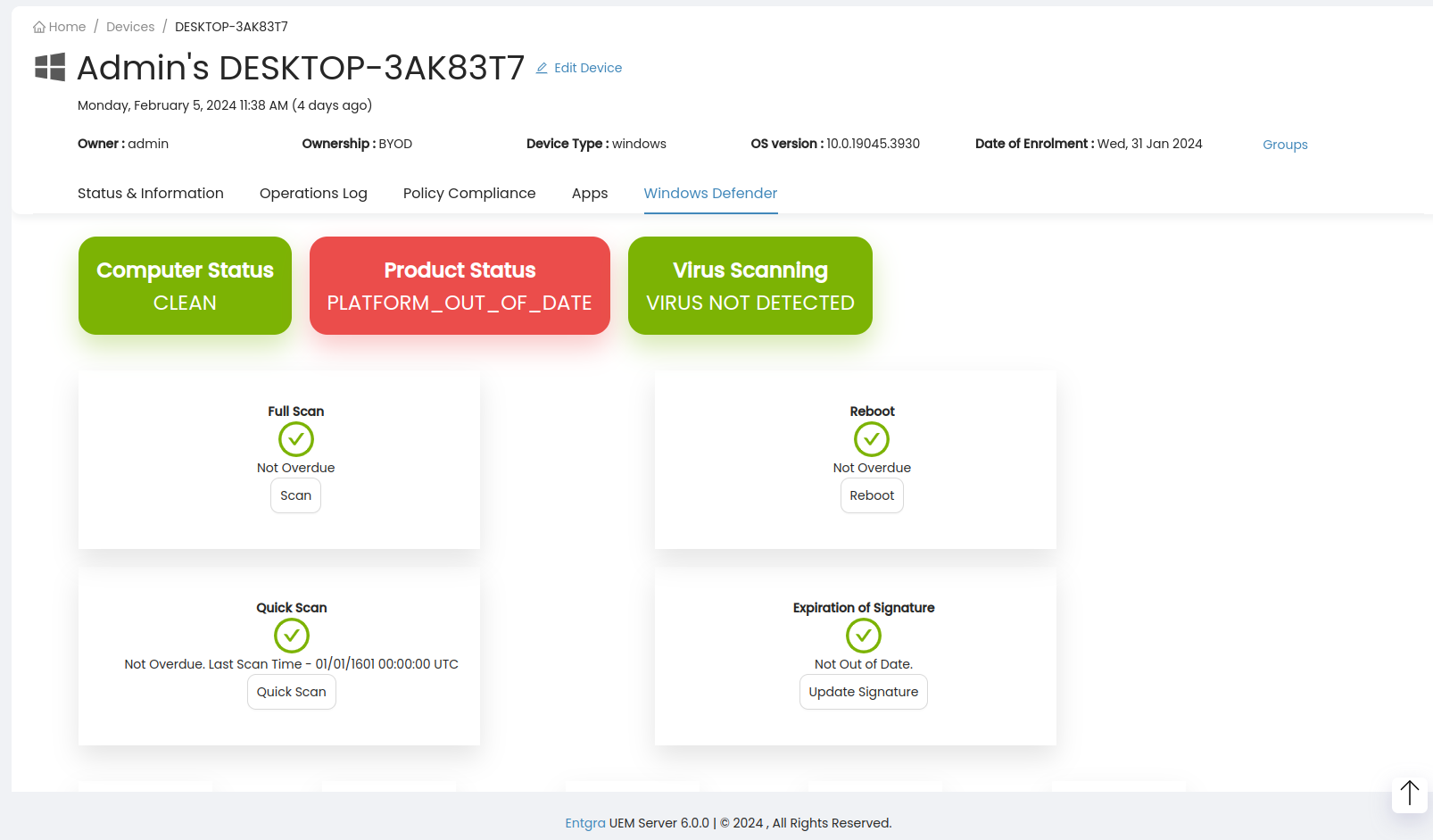
1). Green circles in right hand side should be smaller [1]
2). when hover over cards it shows the cards are clickable, but they are actually unclickable(except for "virus scanning").
3). reboot, update buttons are misaligned.
4). when a virus found there is a different UI for the report. cannot go to that UI when click on virus scan
old UI [2]
5). when hover over a card it should display data(description)
proposed UI [3], [4]
6) it looks like left and right side portions are not matching. if its possible reduce the left side portion(currently too much white space)
[1]![[1] [1]](/attachments/download/3561/Screenshot%20from%202024-03-21%2018-34-40.png)
 Updated by Oshani Silva almost 2 years ago
 Updated by Oshani Silva almost 2 years ago
- Status changed from Needs Improvement to QA
 Updated by Arshana Atapattu almost 2 years ago
- Status changed from QA Accept to Closed
Closing due to QA accept
Actions
![[4] [4]](/attachments/download/3562/Screenshot%20from%202024-03-21%2018-52-30.png)