Improvement #11488
closedTask #11566: Enhance the application subscription and unsubscription details accessing functionality
Implement breadcrumbs to Subscription Details
100%
Files
 Updated by Lasantha Dharmakeerthi over 1 year ago
- Parent task changed from #11442 to #11566
 Updated by Lasantha Dharmakeerthi over 1 year ago
- Project changed from product-uem 6.2.0 GA to product-uem 6.3.0 GA
 Updated by Lasantha Dharmakeerthi over 1 year ago
- Assignee set to Nipuni Kavindya
 Updated by Lasantha Dharmakeerthi over 1 year ago
- Project changed from product-uem 6.3.0 GA to product-uem 6.2.0 GA
- Parent task deleted (
#11566)
 Updated by Nipuni Kavindya over 1 year ago
- Due date set to 26/07/2024
- Status changed from New to QA
- % Done changed from 0 to 100
 Updated by Lasantha Dharmakeerthi over 1 year ago
- Project changed from product-uem 6.2.0 GA to product-uem 6.3.0 GA
- Parent task set to #11566
 Updated by Lasantha Dharmakeerthi over 1 year ago
- Assignee changed from Nipuni Kavindya to Oshani Silva
 Updated by Oshani Silva over 1 year ago
- File clipboard-202407260855-8h3o1.png clipboard-202407260855-8h3o1.png added
- File clipboard-202407260857-rjoab.png clipboard-202407260857-rjoab.png added
- File clipboard-202407260859-j6ccc.png clipboard-202407260859-j6ccc.png added
- % Done changed from 100 to 0
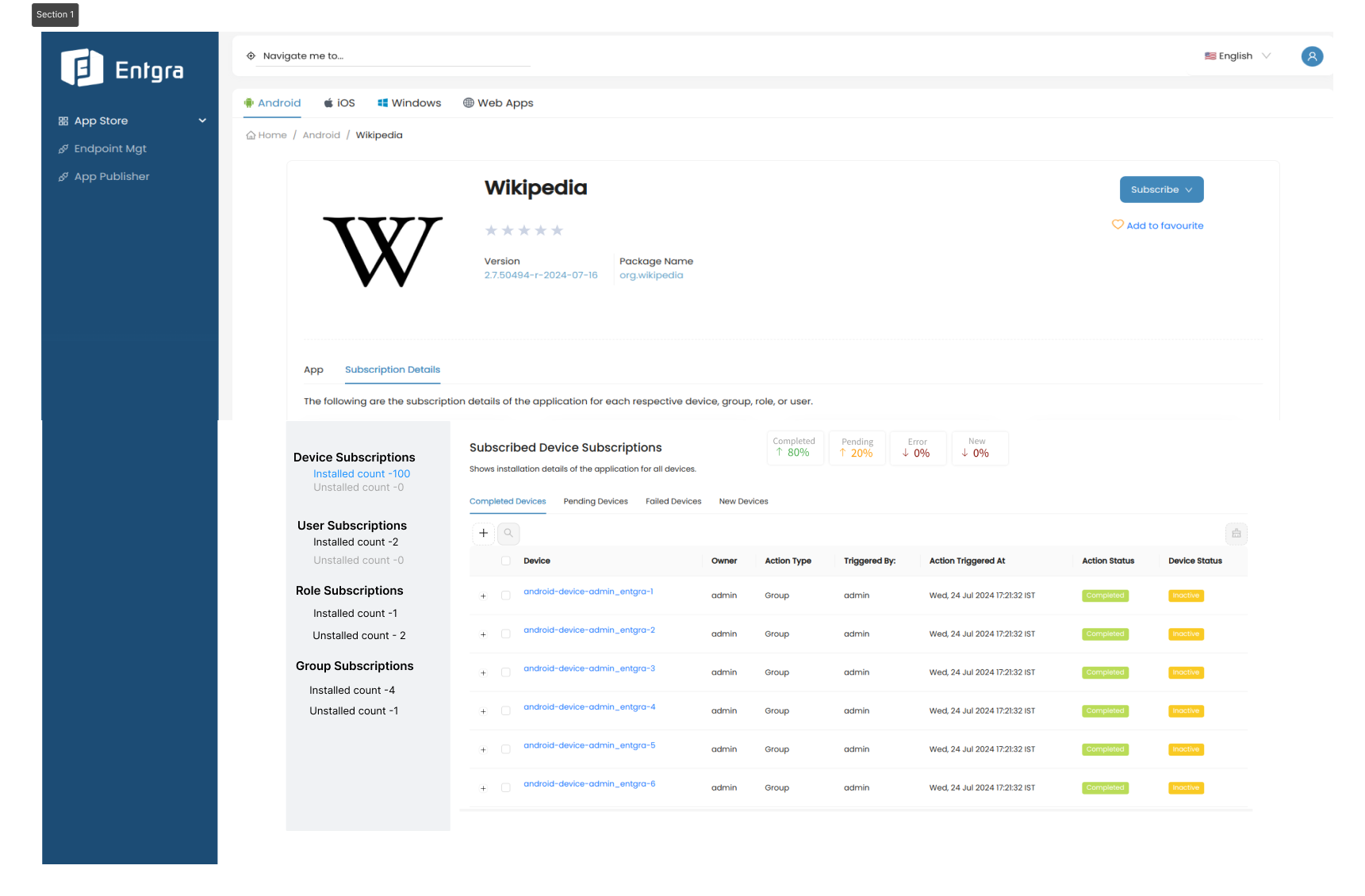
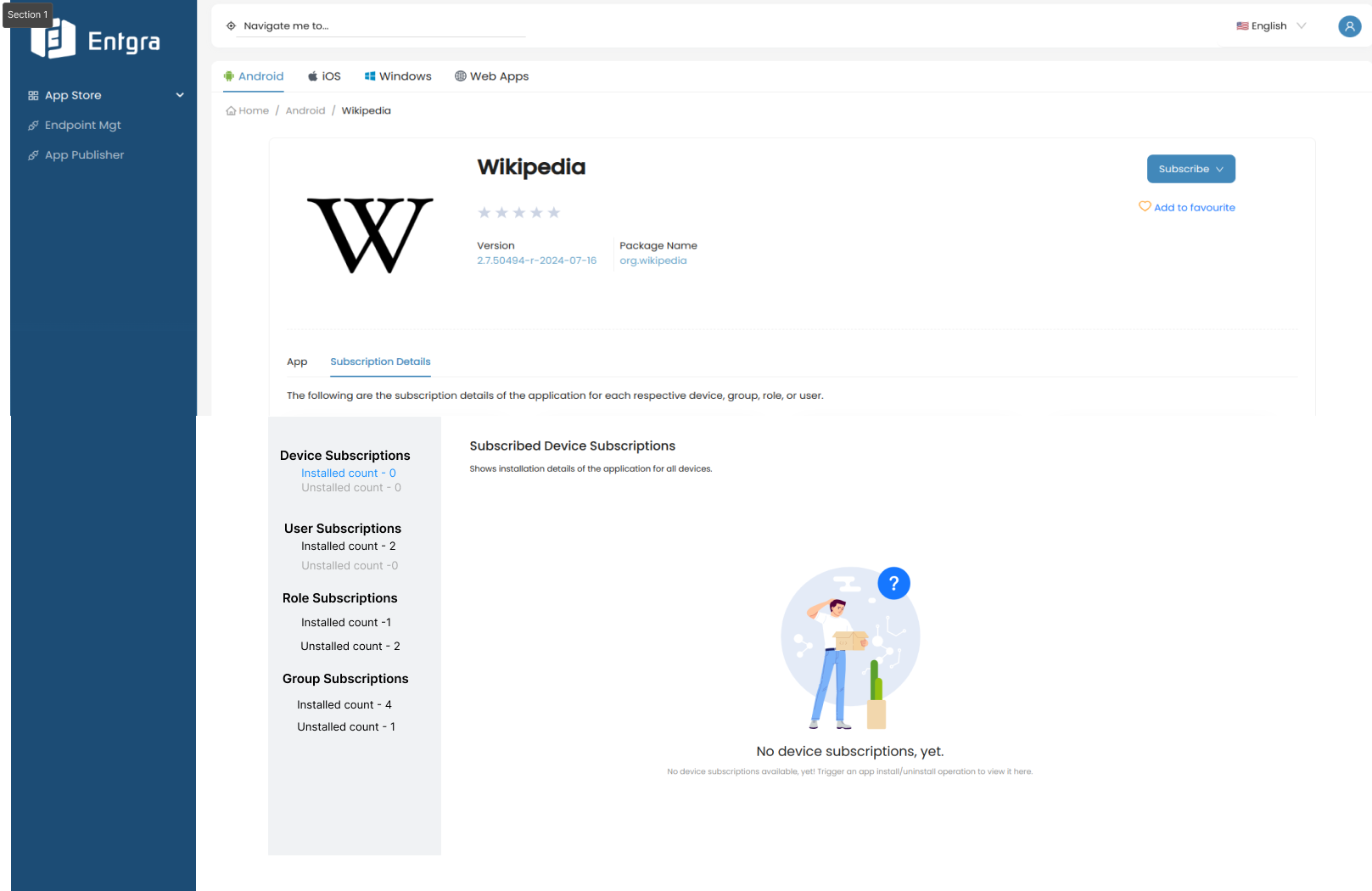
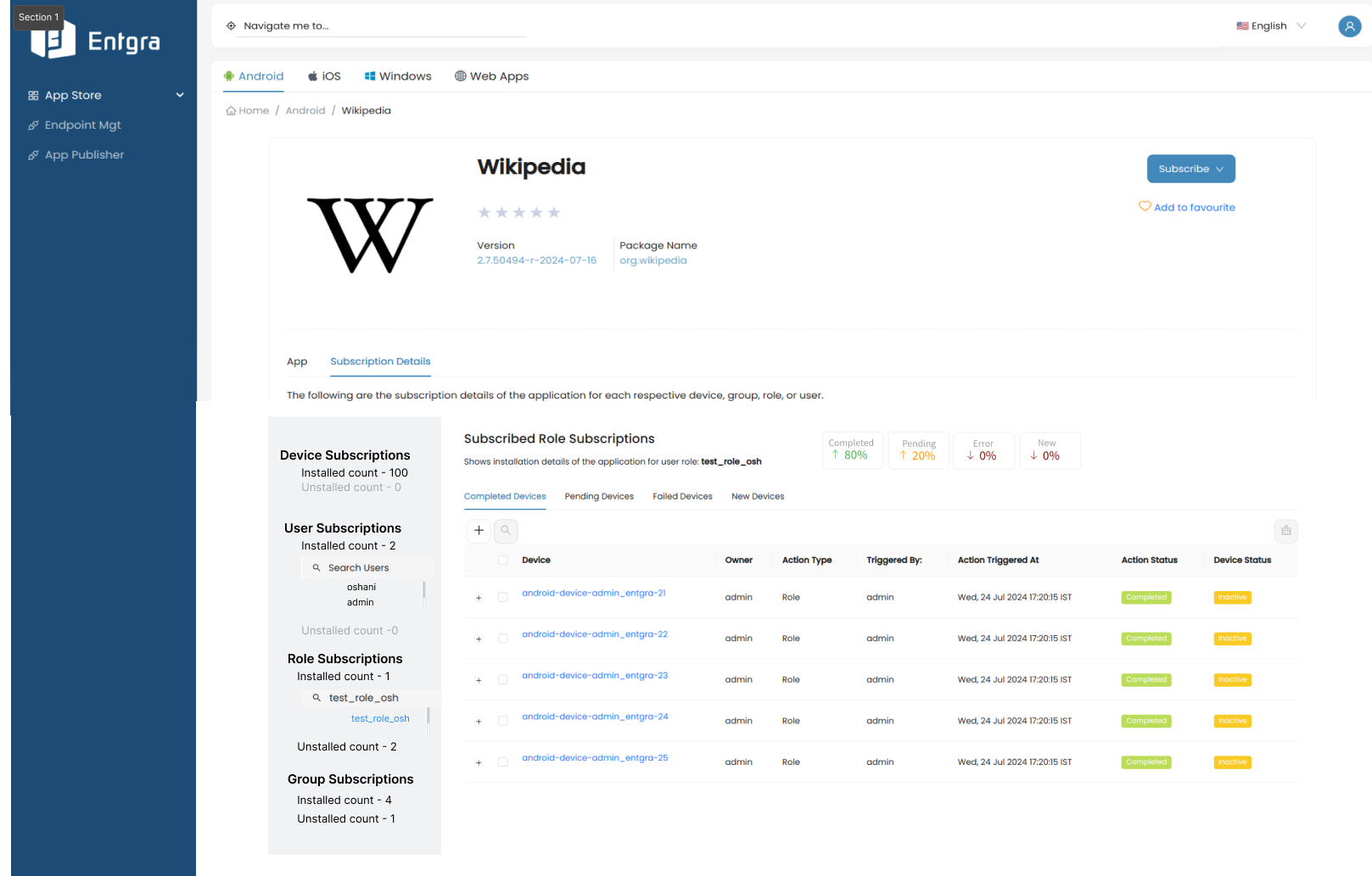
New design improvements for subscription page view.
- Subscription Details page load view

2. Subscription Details page load - No data available View

3. Subscription Details sidebar navigation search

 Updated by Oshani Silva over 1 year ago
- Due date changed from 26/07/2024 to 16/08/2024
- Assignee deleted (
Oshani Silva) - Priority changed from None to High
- Start date changed from 05/07/2024 to 07/08/2024
- Type set to UI
 Updated by Oshani Silva about 1 year ago
- Due date changed from 16/08/2024 to 20/08/2024
 Updated by Oshani Silva about 1 year ago
- Status changed from New to Implementation
- Start date changed from 07/08/2024 to 08/08/2024
 Updated by Thasleem Sulaiman about 1 year ago
- % Done changed from 10 to 70
 Updated by Thasleem Sulaiman about 1 year ago
 Updated by Thasleem Sulaiman about 1 year ago
- % Done changed from 90 to 100
The implementation for the new UI design of the subscription details view has been successfully completed.
 Updated by Oshani Silva about 1 year ago
- Status changed from Implementation to QA
 Updated by Lasantha Dharmakeerthi about 1 year ago
- Status changed from QA to Closed
 Updated by Arshana Atapattu about 1 year ago
- File vokoscreen-2024-10-02_16-22-38.mkv vokoscreen-2024-10-02_16-22-38.mkv added
- File vokoscreen-2024-10-02_16-20-55.mkv vokoscreen-2024-10-02_16-20-55.mkv added
- Status changed from QA to Needs Improvement
Issue 1:
User should not be able to click on "installed" or "uninstalled" if there are no subscription for them.
When user is able to click on them it brings to a empty table: Refer the video [1]
Issue 2:
Please reconsider the UI of the breadcrumb. This view is not user friendly. If there are multiple items and the names are long things are gonna get messy.
Please refer the video [2]
Issue 3:
When searched a device and if ther are no devices with the searched criteria, the search bar is vanished [3]. this did not happened in 620 pack [4]
Refer the video [3]
Issue 4:
Device name is not aligned according to row [4]
note: All videos are attached to the ticket
 Updated by Arshana Atapattu about 1 year ago
- File Screenshot from 2024-10-02 17-23-29.png Screenshot from 2024-10-02 17-23-29.png added
- File vokoscreen-2024-10-02_17-20-47.mkv vokoscreen-2024-10-02_17-20-47.mkv added
Arshana Atapattu wrote in #note-22:
Issue 3:
When searched a device and if ther are no devices with the searched criteria, the search bar is vanished [3]. this did not happened in 620 pack [4]
Refer the video [3]
[4]![[4] [4]](/attachments/download/4230/Screenshot%20from%202024-10-02%2017-23-29.png)
 Updated by Arshana Atapattu about 1 year ago
Issue 4:
Device name is not aligned according to row [4]
[4]![[4] [4]](/attachments/download/4246/Screenshot%20from%202024-10-10%2012-32-19.png)
 Updated by Oshani Silva about 1 year ago
- Status changed from Needs Improvement to QA
 Updated by Arshana Atapattu about 1 year ago
- File Screenshot from 2024-10-23 17-40-46.png Screenshot from 2024-10-23 17-40-46.png added
- Status changed from QA to Needs Improvement
Arshana Atapattu wrote in #note-22:
Issue 1:
User should not be able to click on "installed" or "uninstalled" if there are no subscription for them.
When user is able to click on them it brings to a empty table: Refer the video [1]Issue 2:
Please reconsider the UI of the breadcrumb. This view is not user friendly. If there are multiple items and the names are long things are gonna get messy.
Please refer the video [2]Issue 3:
When searched a device and if ther are no devices with the searched criteria, the search bar is vanished [3]. this did not happened in 620 pack [4]
Refer the video [3]Issue 4:
Device name is not aligned according to row [4]
Issue 1-3 are fixed.
But in issue 4, in New Devices the device names are no aligned [5].
please check all completed, pending, error, New devices name align
[5]![[5] [5]](/attachments/download/4304/Screenshot%20from%202024-10-23%2017-40-46.png)
 Updated by Thasleem Sulaiman 10 months ago
Fixed the alignment issue - Issue 4
https://github.com/entgra-proprietary/proprietary-commons/pull/10
 Updated by Thasleem Sulaiman 10 months ago
- Status changed from Needs Improvement to QA
 Updated by Arshana Atapattu 10 months ago
- Status changed from QA Accept to Closed
Closing due to QA accept